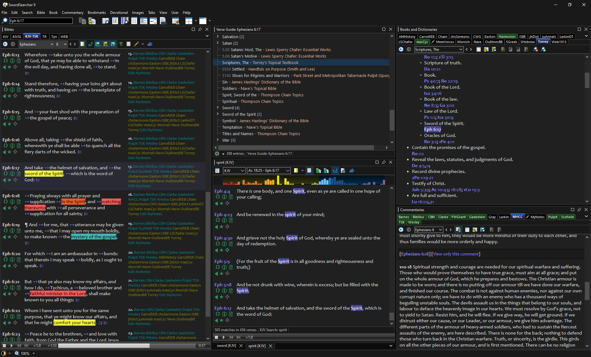
The most obvious change in this release is the addition of a dark mode interface.

This has been a long-standing request from SwordSearcher users. I had started and then stopped development on the dark mode interface several times over the last decade.
The truth is, getting it right is hard. SwordSearcher is what some people might call a legacy application. It’s not abandoned or irrelevant, but it’s roots go deep, back over 20 years into Windows. There are literally hundreds of places that are affected by something like changing the interface color. I couldn’t just flip some magical switch and “make it dark.” SwordSearcher has dozens of customizable colors and hundreds of places where color matters. There are dozens of controls that I have purchased over the years that assume various things about how buttons and frames and backgrounds are drawn, and those things have to be fixed. And then there are things like user-supplied library texts that have hard-coded text colors that suddenly become invisible with a dark background, highlighting colors that can cause the same issue with light colored text, and then what happens when the user sets his preferred colors in dark mode and switches to light mode… and the list goes on.
And quite a list it was.
But in the end, the work was worth it.
Dark mode is not for everybody. But it is for a lot of us.
Over the last several years I have had to deal with migraines which are exacerbated by extended screen time. But I found that switching applications over to dark interfaces actually helped. Not all applications support this, and SwordSearcher didn’t, but I found that changing my text editor and programming IDE to use a dark interface made a big improvement in my eyestrain and reduced the frequency and intensity of my migraines.
So I decided that the dark mode interface would become my top priority and get done right.
By “done right” I mean: not just “white text on a black background.” Extreme contrast in dark modes is pretty harsh and, for me, even worse than a bright interface. A lot of time was spent tweaking colors to arrive at a good interface and a set of default text/background colors I was delighted to use myself. (Of course, you are free to change these colors in SwordSearcher to something that you are delighted to use.)
And finally, when working Saturday night to finish preparing a Bible lesson for the next day, I didn’t feel like I was pushing my eyes too hard and rushing to get finished.
This was one of the “bigger” updates I have worked on for SwordSearcher in the last several years and part of the reason for the major version number jump to 9.
(Unlike other software company marketing people, I know what number comes after 8.)
The other main reason is that Windows is about to get it’s first major version number update in several years. And though Microsoft is very good about not breaking software in their OS updates, there were some needful changes to be made in SwordSearcher to accommodate some of the changes to how controls are drawn in Windows 11. That’s done, and SwordSearcher runs and looks great in Windows 11.
If you’re a SwordSearcher user I think you will be happy with the improvements. Here’s more information on the changes.